
Your dining room does more than host meals. It sets the mood for connection, conversation, and celebration. It’s where holidays unfold, friends linger over dessert, and family stories are shared long after the plates are cleared. The right dining room paint colors can make those moments feel even more inviting, turning an everyday space into the heart of your home.
From timeless neutrals to bold statement shades, color influences how people experience a room. Lighter hues can make small dining areas feel open and airy, while richer tones bring intimacy and warmth to larger spaces. In Portland, where the light shifts from soft gray to golden glow depending on the season, choosing a palette that complements natural light is key.
At Absolute Painting, our Portland-based team has been transforming dining rooms across Hillsboro, Beaverton, and the greater metro area for more than 30 years. We use premium Sherwin-Williams and Benjamin Moore paints to create smooth, lasting finishes that reflect your home’s character. If you’re planning a refresh, our interior painting services make it easy to bring your vision to life with expert color selection and flawless application.
In this guide, you’ll discover the most inspiring dining room paint colors for 2025 and 2026, along with professional tips to help you choose shades that fit your home’s lighting, style, and personality.
Timeless Dining Room Paint Colors That Never Go Out of Style
Classic never means boring when it comes to dining room paint colors. Timeless shades create a backdrop that adapts to every season, table setting, and design style. Whether your home leans traditional or modern, these versatile hues offer warmth, balance, and longevity.
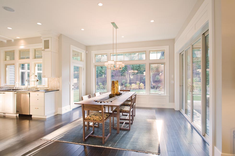
- Warm Whites and Creamy Neutrals: Soft white and off-white tones remain a favorite for homeowners who want a bright yet welcoming atmosphere. Sherwin-Williams Alabaster and Benjamin Moore White Dove are two top choices that provide warmth without feeling yellow. They pair beautifully with wood furniture, statement lighting, and Portland’s softer natural light.
- Greige and Soft Taupe: For a bit more depth, greige (a blend of gray and beige) offers a sophisticated, modern feel. Benjamin Moore Edgecomb Gray and Sherwin-Williams Accessible Beige both work well in dining rooms with mixed décor styles—especially those combining rustic and contemporary elements. Their subtle undertones shift naturally with Portland’s changing daylight.
- Classic Gray and Pale Stone: Light grays with warm undertones, such as Sherwin-Williams Repose Gray or Benjamin Moore Classic Gray, provide an elegant canvas for almost any color palette. They balance beautifully with natural textures like linen, oak, and stone, creating a calm, timeless look that never feels outdated.
Pro Tip: Pair these timeless neutrals with crisp white trim or natural wood tones for a clean, finished aesthetic that enhances your dining room’s architectural details.

Bold Dining Room Colors That Make a Statement
For homeowners who want their dining room to feel memorable, bold hues can define the space and spark conversation. The right dramatic color transforms a simple meal into an experience.
- Deep Navy and Midnight Blue: Rich blues like Benjamin Moore Hale Navy and Sherwin-Williams Naval bring depth and sophistication. They work especially well in dining rooms with white trim, brass accents, or large windows that let natural light balance the richness of the shade.
- Forest and Olive Greens: Drawing inspiration from Oregon’s landscape, Sherwin-Williams Pewter Green and Benjamin Moore Caldwell Green evoke a grounded, organic feel. These hues pair beautifully with natural wood tables and black or bronze light fixtures, blending elegance with warmth.
- Charcoal and Graphite Gray: For a modern alternative to black, Sherwin-Williams Iron Ore offers striking contrast without harshness. It’s ideal for open-concept homes where you want to anchor the dining area without overpowering nearby rooms.
Painter’s Insight: Darker shades require careful surface prep and even coverage. Professional application ensures consistent tone and clean edges—especially important when bold colors meet lighter trim or ceilings.
Warm Dining Room Paint Colors for a Cozy, Inviting Space
Warm colors bring comfort and connection to the dining room, creating an atmosphere that encourages guests to relax and stay awhile. These hues work especially well in Portland homes, where gray skies often call for a little extra warmth indoors.
- Terracotta and Clay Tones: Earthy reds and soft clay shades, such as Sherwin-Williams Redend Point or Benjamin Moore Audubon Russet, add character and warmth without overpowering the space. They complement wood furniture and natural materials beautifully.
- Golden Beige and Honey Neutrals: Colors like Benjamin Moore Manchester Tan or Sherwin-Williams Natural Linen bring gentle light into the room, reflecting warm undertones that counterbalance cool daylight during winter months.
- Muted Mustard and Warm Ochre: For homeowners who want a touch of color without going bold, soft yellows like Sherwin-Williams Mannered Gold create a cozy, sunlit glow that feels inviting all year long.
Local PNW Tip: Warm tones work best in north-facing dining rooms or spaces with limited natural light. Pair them with off-white trim to enhance brightness while keeping the palette grounded and timeless.
Cool Dining Room Colors for a Modern, Airy Feel
Cool colors create a sense of calm and sophistication, making dining spaces feel open, balanced, and effortlessly modern. They’re especially effective in well-lit rooms or homes with warm wood tones that can offset cooler hues.
- Pale Blue and Misty Gray: Soft blues like Benjamin Moore Silver Mist and Sherwin-Williams North Star add freshness without feeling cold. They pair beautifully with crisp white trim, glass light fixtures, and silver or chrome accents.
- Slate Gray and Steel Blue: For a bolder but still refined look, try Sherwin-Williams Serious Gray or Benjamin Moore Smoke. These versatile tones transition smoothly from daylight to evening, maintaining depth under artificial lighting.
- Soft Sage and Muted Green: Subtle greens such as Sherwin-Williams Sea Salt or Benjamin Moore Saybrook Sage bring an organic, restorative quality to the dining room. They blend beautifully with the natural surroundings of the Pacific Northwest.
Accent Walls and Architectural Highlights
If you’re not ready to repaint your entire dining room, an accent wall is an easy way to add contrast and personality. A deep tone behind the dining table, such as Sherwin-Williams Iron Ore or Benjamin Moore Hale Navy, creates a focal point that draws guests in. According to Livingetc, even a dark accent wall can make a room appear larger and more dynamic when balanced with lighter tones on the surrounding walls.
Accent walls don’t need bold color alone to stand out. Texture can make just as much impact. Adding wainscoting, board-and-batten, or shiplap painted in a satin or matte finish brings subtle depth and character.
A blend of paint and wallpaper can also bring charm and dimension. A patterned wall framed by neutral paint, such as Sherwin-Williams Drift of Mist or Benjamin Moore Simply White, adds visual interest while maintaining an elegant feel.
Accent features like these help define the dining room as a distinct gathering space, especially in open-concept homes. When applied with professional precision, they can completely transform how the room feels and functions.
Lighting and Color Considerations in the Pacific Northwest
Choosing dining room paint colors in Portland and the surrounding areas means working with ever-changing light. Overcast skies, tall trees, and soft natural light can all shift how colors appear throughout the day.
- Balance cool light with warm tones. During gray winter months, cooler natural light can make paint colors feel muted. Warmer hues—like creamy whites, soft terracotta, or golden beige—help maintain a welcoming atmosphere year-round.
- Consider your light sources. Evening lighting can alter undertones. Warm incandescent bulbs enhance reds and yellows, while cool LED bulbs emphasize blues and grays. Test samples under both conditions before finalizing a color. For a deeper look at how different light sources interact with pigments, Sherwin-Williams explains the science behind lighting and paint color and why those subtle shifts can change a room’s entire feel.
- Maximize natural light. If your dining room has large windows or connects to an open living space, lighter shades like Sherwin-Williams Drift of Mist or Benjamin Moore Classic Gray will reflect light beautifully and keep the space feeling open.
For personalized help evaluating your space, Absolute Painting offers professional color consultations to identify the best paint colors for your dining room lighting, décor, and home layout.
Dining Room Color Trends for 2025 and 2026
As we move into 2025 and 2026, dining room color trends continue to blend natural warmth with modern sophistication. Portland homeowners are favoring palettes that reflect the Pacific Northwest’s landscapes while maintaining a timeless feel.
- Moody Earth Tones: Deep greens, clay reds, and rich browns remain favorites for their connection to Oregon’s forests and soil. Shades like Sherwin-Williams Pewter Green or Benjamin Moore Terra Cotta Tile create grounded, inviting dining spaces that feel elegant without being formal.
- Soft Organic Neutrals: Colors inspired by natural materials—sand, oat, and warm white—are replacing cooler grays. These shades pair well with wood accents, woven textiles, and black metal fixtures for a balanced, modern look.
- Statement Darks: Black dining rooms are gaining attention for their unexpected sophistication. When balanced with natural light, matte black or charcoal walls can make a dining space feel luxurious and intimate rather than heavy.
- Updated Blues: Classic blues are shifting toward muted, coastal-inspired tones such as Benjamin Moore Smoke or Sherwin-Williams Debonair—both calm, versatile choices that complement a variety of furniture finishes.
Common Mistakes to Avoid When Choosing Dining Room Colors
A great dining room color should enhance both the space and the experience. Before you commit to a shade, here are a few common pitfalls to avoid.
- Ignoring Trim and Ceilings: Walls aren’t the only surfaces that influence how a room feels. Crisp white trim adds structure against bold walls, while painting the ceiling a few shades lighter can make the space feel taller and more open.
- Overlooking Existing Furniture and Décor: Paint should complement—not compete with—your dining table, flooring, or light fixtures. Warm wall colors pair beautifully with darker wood tones, while cool shades balance lighter finishes like oak or maple.
- Skipping Sample Tests: Paint looks different in every home, especially under Portland’s shifting light. Always test swatches on multiple walls and observe them throughout the day before finalizing a color.
- Following Trends Without Context: What’s popular online might not suit your home’s architecture or natural light. Use trends as inspiration, but adapt them to your space for a look that lasts.
- Underestimating the Prep Work: Even the best color can fall flat if applied to uneven walls or without proper priming. Investing in professional interior painting services ensures a smooth, lasting finish that elevates your entire dining space.
Transform Your Home with Expert Dining Room Painting Services
The right dining room paint color can completely change how your home feels. Whether you’re drawn to soft neutrals, bold statement hues, or warm earth tones that reflect the Pacific Northwest landscape, your walls set the mood for every meal and gathering.
For expert application and lasting results, Absolute Painting’s professional interior painting services ensure your dining room looks beautiful from every angle. With more than 25 years serving homeowners across Portland, Hillsboro, and Beaverton, our team helps you choose colors that reflect both your style and your home’s architecture.
Dining Room Paint Colors FAQs
What are the most popular dining room paint colors for 2025?
Warm neutrals, moody greens, and soft clay tones are leading trends for 2025. Portland homeowners are also embracing darker hues like charcoal and navy for a sophisticated, cozy atmosphere.
Which paint colors make a dining room feel bigger?
Light, reflective shades such as Sherwin-Williams Drift of Mist or Benjamin Moore Classic Gray help small or low-light dining rooms feel more spacious. Keeping trim and wall colors in the same tone also blurs boundaries and opens up the room.
Should a dining room be warm or cool in tone?
That depends on your home’s lighting and furniture. Warm tones like beige or terracotta add comfort and depth, while cool tones like sage or blue-gray create a modern, airy look. If your dining area lacks natural light, warm hues are usually more inviting.
What color pairs best with wood furniture?
Neutrals with warm undertones—like taupe, cream, or soft greige—complement wood tones beautifully. They highlight natural textures and keep the space feeling balanced and timeless.
Is it OK to use dark paint in a dining room?
Yes. Deep colors such as navy, charcoal, or forest green can make dining rooms feel more intimate. As Livingetc notes, darker walls can even make a room appear larger when balanced with lighter trim and good lighting.
Do I need professional painters for a dining room project?
Hiring professionals ensures even coverage, crisp edges, and lasting results. Absolute Painting’s team handles every detail—from prep work to finish—so your dining room transformation is flawless and stress-free.
Still have questions? Contact our professional paint color consultants for more ideas!

